Giving every story a home
Boston Housing Authority
The Challenge
A long history and a shift in perspective
When the Boston Housing Authority (BHA) was established in 1935, during the depths of the Great Depression, public housing was seen as a progressive way to address urban poverty and improve living standards for low-income residents across the city. Eighty-five years later, the BHA stands as Boston’s largest housing provider in a completely different social environment.
For many, the agency had become part of the problem, not the solution, with “failed” housing projects standing as symbols of outdated thinking. The BHA’s brand identity, originally developed in the 1980’s, seemed to reinforce this perspective, even as the agency sought to modernize its services under new management. It was clear to the BHA that they needed a new brand – and that’s when Argus came into the picture.
Services Provided:
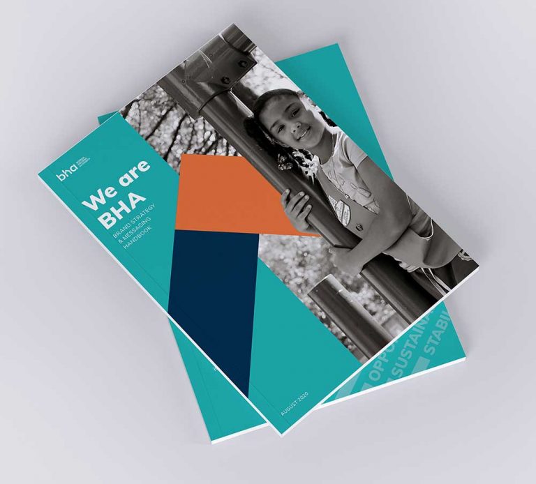
- Branding
- Strategic Messaging
- Visual Identity and Design


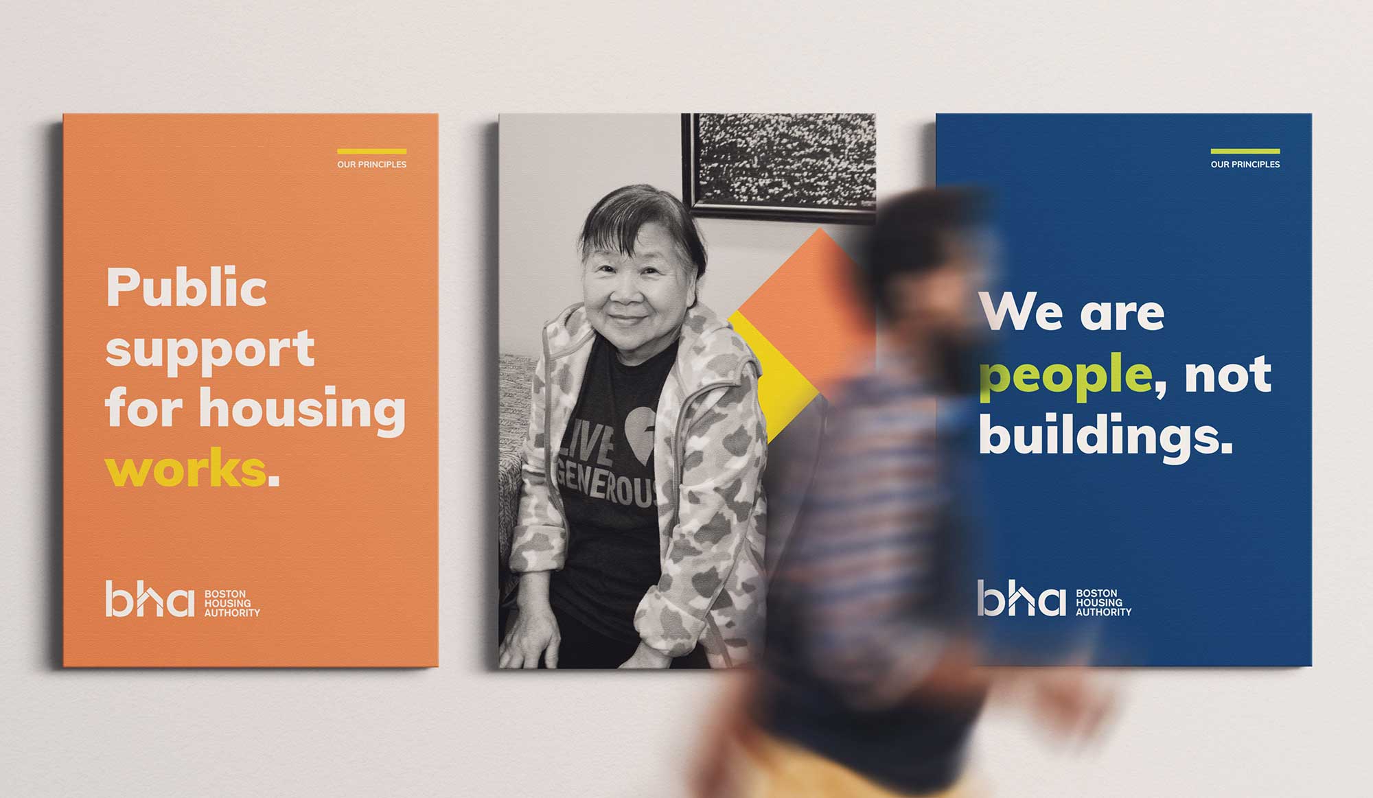
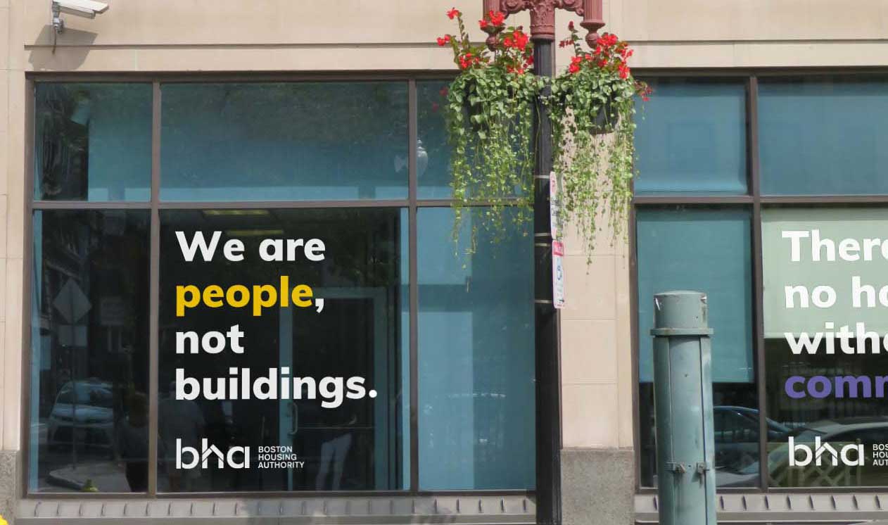
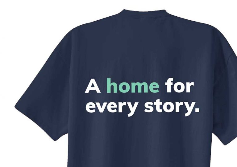
“The new logo and tagline put people and community front and center.”
The Solution
Changing the narrative on public housing
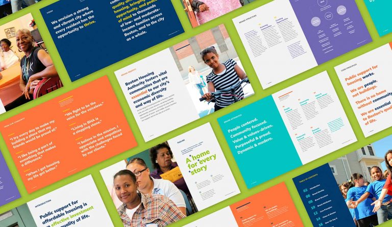
After formative research and initial conversations with leadership, we quickly realized that a visual identity was only the beginning. To achieve the BHA’s strategic goals, it wasn’t enough to make the agency look modern. We needed to change the narrative and reframe government as a contemporary solution for Boston’s affordable housing crisis. In other words, we needed to rebrand public housing.
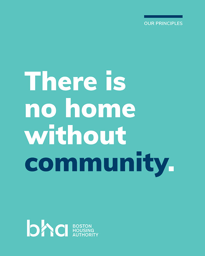
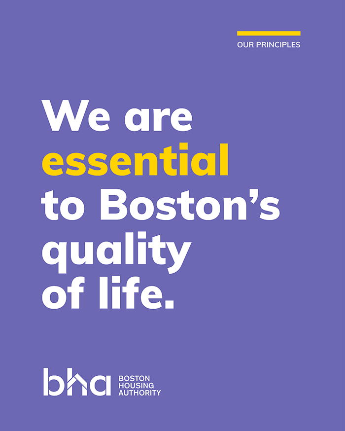
Our first task was to bring everyone on board. Meetings with management, residents, housing advocates, and other important stakeholders encouraged meaningful dialogue and brought a wide range of perspectives into the project. One thing came through loud and clear: the passion and sense of mission that drove the agency even as it faced fiscal challenges and public misconceptions. We used what we learned to craft a new position for the BHA, one focused on fostering community and creating opportunities not just for residents but the city as a whole. New strategic language spoke proudly of the agency’s essential civic role: to promote economic diversity and preserve Boston as a place that belongs to all.
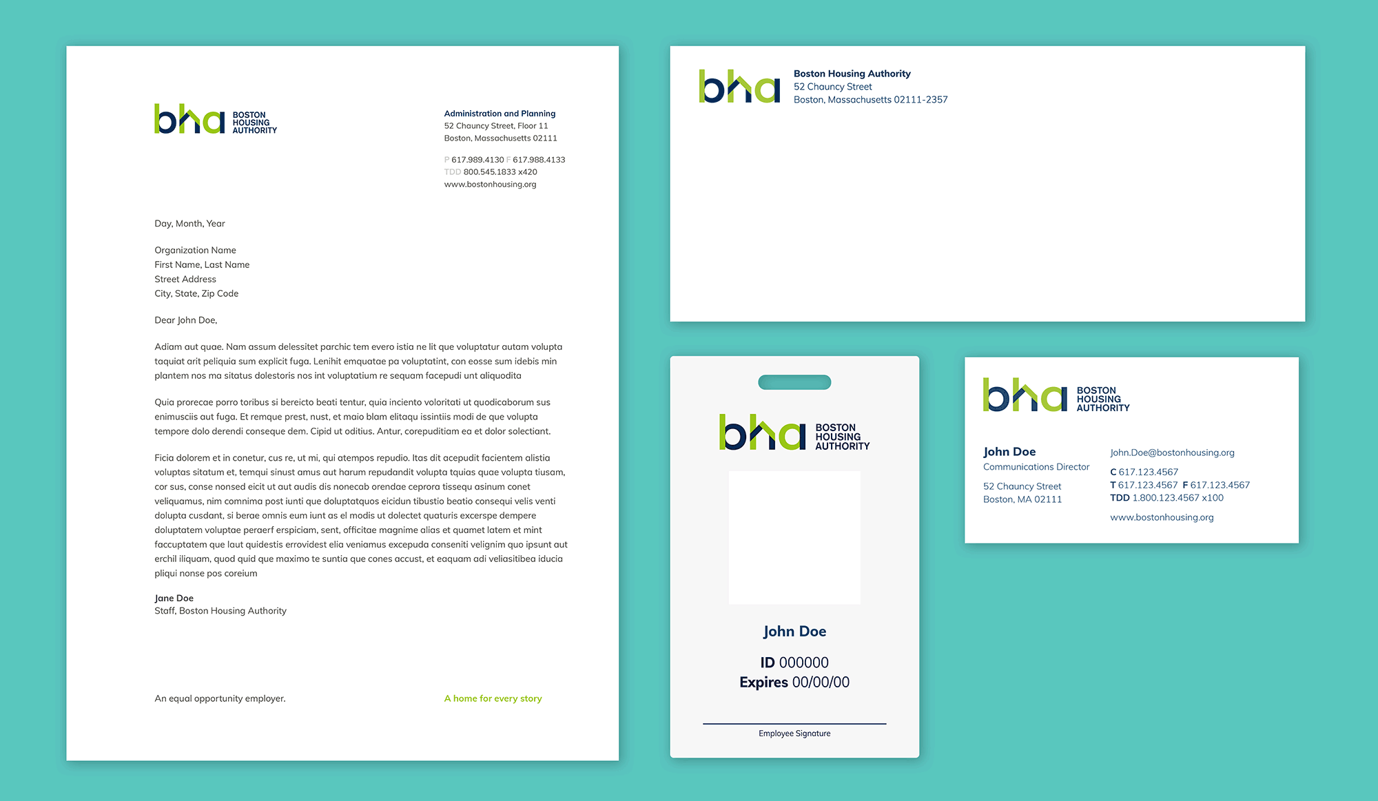
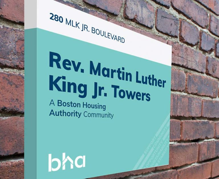
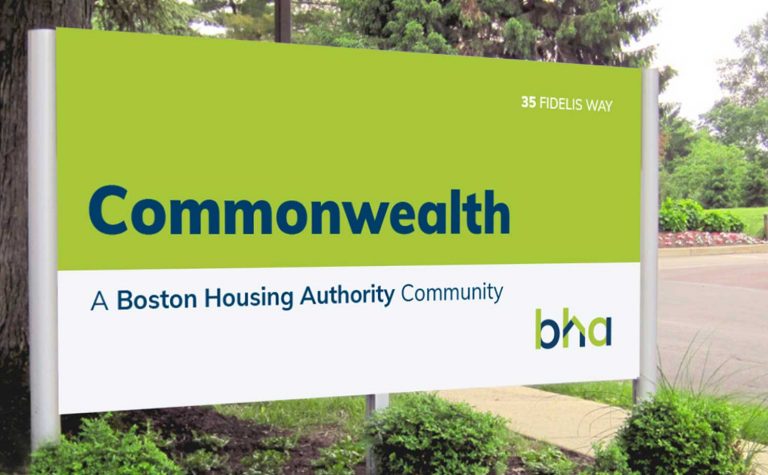
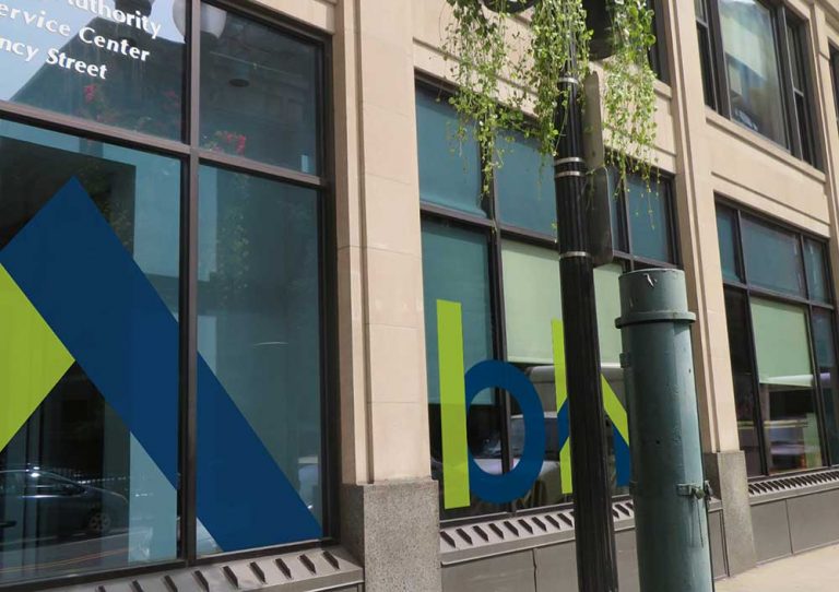
Just as important, we developed a new visual identity anchored by a contemporary logo and a fresh color palette that captured the energy and spirit of the agency. Working with the BHA’s communications staff, we created everything from traditional branding collateral, to newsletter and email templates, exterior and interior graphics, apparel, vehicle wraps, and a unified property signage system, and a photographic art direction that turned existing assets into new and exciting compositions.
The Results
An agency proud to be relevant
Implementation of the visual identity is ongoing, with new collateral and refreshed website currently in use, and new signage appearing at several BHA communities and in their downtown headquarters. Just as important, the new brand messaging has been embraced by the BHA, making its way into day-to-day communications and helping staff frame what they do as essential to Boston’s well-being – especially during the COVID-19 pandemic.